Projects / California crash analyzer
California crash analyzer
1.7M California collision records turned into a dashboard you can actually query
The problem
California’s SWITRS collision records are rich and close to unusable in raw form: 1.7 million rows and thirty-plus coded columns in a single 400 MB file. Every question you would actually want to ask of it (which violation categories dominate fatal crashes in a given city, where collisions cluster, how severity has shifted year over year) requires writing code first. I built the dashboard that answers them by clicking.
What it does
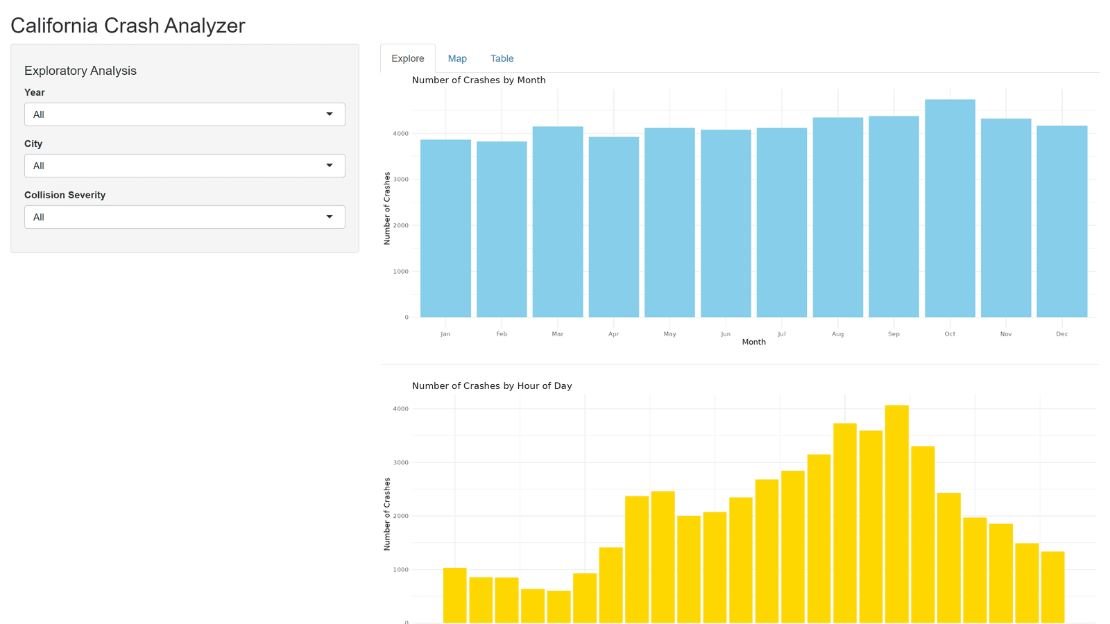
Three tabs, each with its own filter set:
- Explore. Five exploratory plots driven by year, city, and severity filters, covering collision types, contributing violation categories, temporal patterns, and severity breakdowns.
- Map. A Leaflet map plotting individual collisions at their reported coordinates on a CartoDB Positron basemap, colored by a severity palette. Filters for year, collision type, severity, and violation type isolate a specific crash profile geographically.
- Table. A searchable, sortable view of the filtered records, so whatever you spot in the other two tabs can be traced back to the rows behind it.
Honest caveats, on purpose
The full extract is roughly 400 MB, over GitHub’s per-file limit, so the repo and the hosted demo run on a 50,000-record sample: stratified at 5,000 per year with a fixed seed, filtered to valid in-state coordinates, spanning all 10 years, 4 severity levels, and 442 cities. Because the stratification is equal by year rather than proportional, year-over-year volume comparisons in the demo are not meaningful, and the README says so. Point the app at the full SWITRS file and it runs unchanged.
The interesting engineering constraint was keeping a dataset that size responsive under user-driven filtering, which is also why the hosted version runs on the sample.
Stack: R, Shiny, tidyverse, lubridate, Leaflet, ggplot2, plotly.
Skills demonstrated
R, Shiny, large-dataset handling and sampling design, geospatial visualization, interactive dashboard design, public-records data wrangling, reproducibility, and stating a dataset’s limitations plainly.